
Ever wondered where those Inter-Zone Egress costs are coming from? Found yourself looking at GCP’s network pricing page many times to break it down? Me too. So I thought I might as well try to help clear things up.
First, Flow Logs
Let’s start with enabling the VPC Flow Logs for your project. This is the quickest and easiest way to see bytes flowing between the Virtual Machines (VMs) on your network without having any ‘dirty’ screen/tmux sessions with tools analyzing network traffic on the VMs.
Let’s wait for a few minutes so that the traffic can flow while we’re logging it now.
Using a filter on Cloud Logging like the below, we shall show some logs, assuming VPC Flow Logs are enabled:
logName=”projects/PROJECT_NAME/logs/compute.googleapis.com%2Fvpc_flows"
It should look somewhat like this:
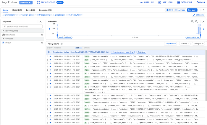
VPC Flow Logs example
The quick Spreadsheet way
Instead of waiting for a full day in order to analyze this via BigQuery or another log sink, we can simply export a spreadsheet/CSV file. For some networks, this might be a fine way to get an initial idea of what’s going on.
If you want to query the logs using SQL, I recommend creating a sink and pushing the logs to a BigQuery dataset.
Now, since you’re able to see VPC flow logs in Cloud Logging, let’s export a CSV file to a Drive of the last 10,000 entries. This will essentially helps us see how many bytes are flowing and where.
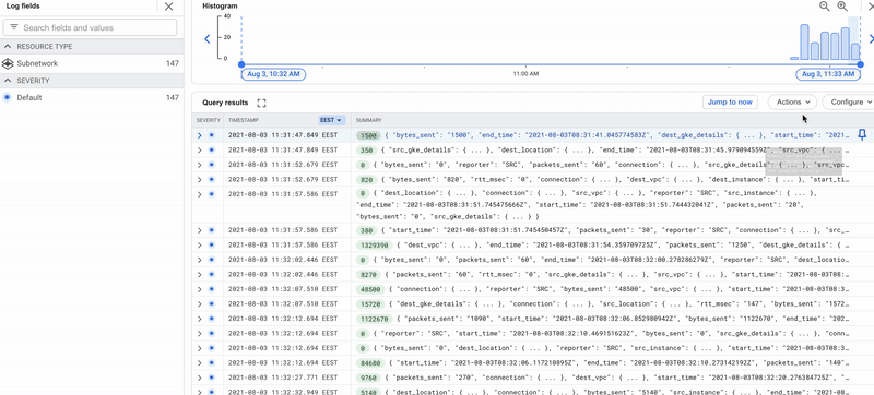
Downloading VPC Flow Logs
On that Google Spreadsheet export and after creating the pivot table with source/destination and bytes_sent, you might want to format bytes into something more readable using the format below:
[<1000000]0.00," KB";[<1000000000]0.00,," MB";0.00,,," GB"
Select the bytes column, head over to Format > Number > More Formats > Custom number format, paste the above and click Apply.
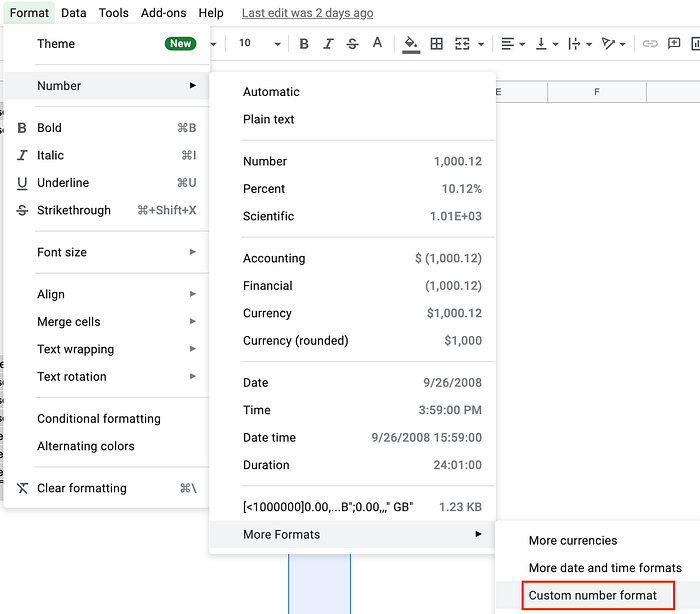
Custom number format
There you go. It’s as easy as that. You now have an initial picture of how your network activity looks. The sum column should have the bytes used tied with source~destination, easily identifiable.
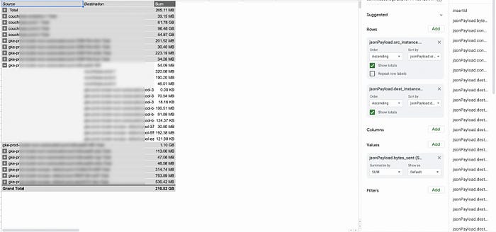
Pivot table on Google Spreadsheets

The BigQuery way
Not able to see a pattern yet? Try a different time period, or wait a full day and try some queries against BigQuery. If you created a sink earlier to BigQuery, you now have a BQ dataset with a sample of logs and bytes recorded per instance.
An example query that can identify the sum of bytes sent between VMs could look like this:
SELECT CONCAT(jsonPayload.src_instance.vm_name, " to ", jsonPayload.dest_instance.vm_name) AS vm_traffic,
 sum(CAST (jsonPayload.bytes_sent AS INT64)) AS bytes_sent
FROM `PROJECT_NAME.DATASET_NAME.compute_googleapis_com_vpc_flows`
WHERE TIMESTAMP >= "2021-07-14 00:00:00 UTC"
GROUP BY vm_traffic
ORDER BY bytes_sent
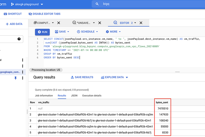
BQ bytes_sent example
How about now? Can you see what’s at the top of the list? :)
How DoiT’s Reporting helps
Google Spreadsheets and BigQuery are great tools for querying this data, but if you are a user of DoiT International’s cloud management platform, you have an even easier path to the it, complete with clear visualizations.
- Log in to DoiT’s Navigator.
- Under Analytics, click Reports and then Create new Report.
- Under Metrics, keep ‘Cost’ (this can also be set to Usage if you want to see usage instead).
- Group by ‘Project/Account ID’.
- Filter by SKU, find and tick ‘Network Inter Zone Egress’:
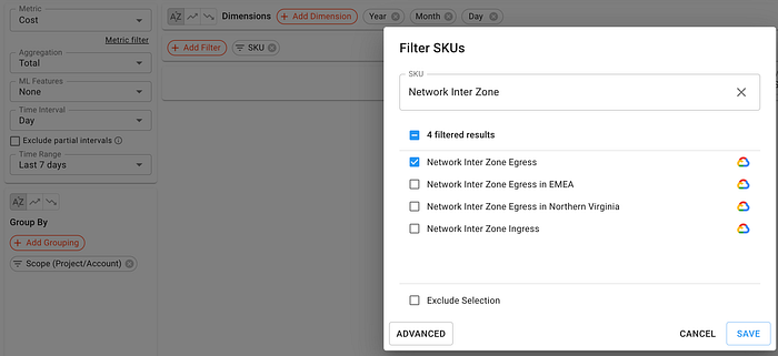
DoiT Navigator SKU Filtering
6. Click Save and Run the report:
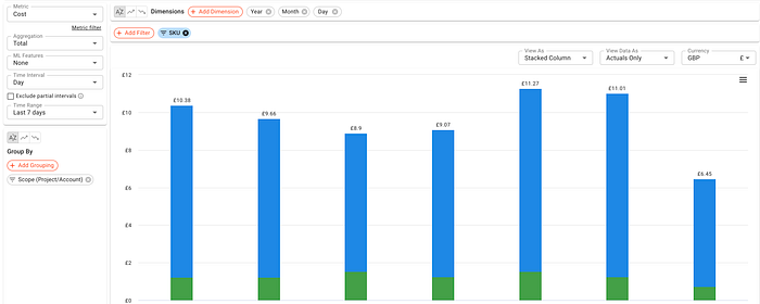
DoiT Navigator Network Inter Zone Egress Report
There you have it. You can also find other operations like email scheduling and more on the left menu.
ps. Don’t forget to turn off your VPC Flow logs.
To stay connected, follow us on the DoiT Engineering Blog , DoiT Linkedin Channel and DoiT Twitter Channel . To explore career opportunities, visit https://careers.doit-intl.com .